
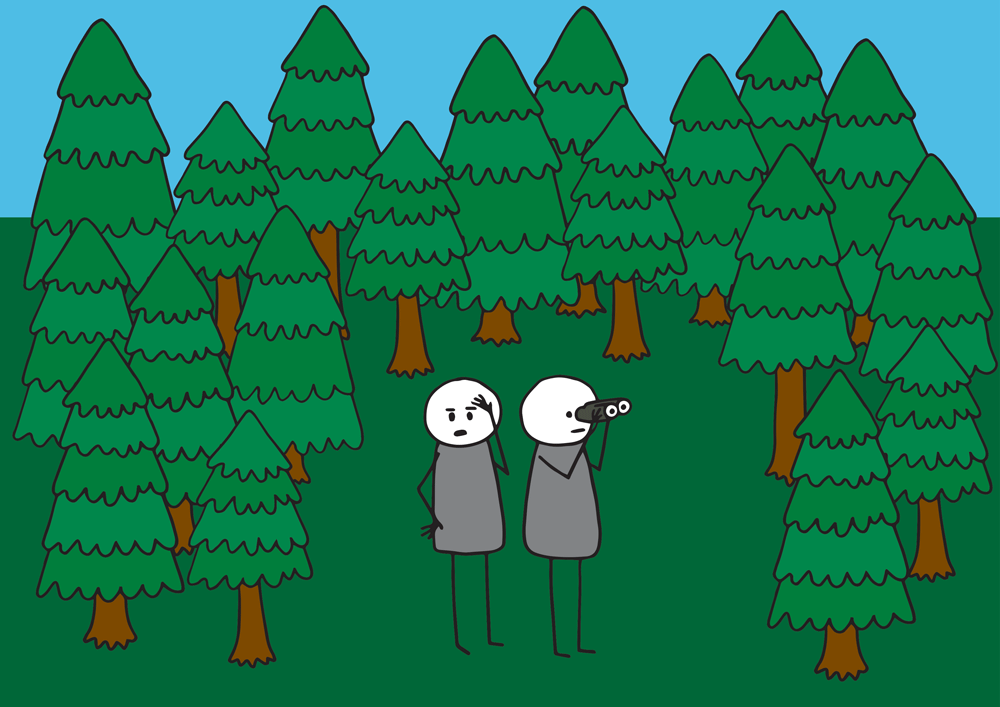
Can’t see the wood for the trees
Long, long ago in a galaxy far, far away, websites ran the gamut from the bland to the Flash™-y and everyone wanted to make them better. Way back in them olden days, there were so many ways to improve the hideousness that some websites were, and so the web design industry flourished. Everyone clamoured for the best website – chasing the elusive ‘best’ like a dog chasing cars.
The funny thing about ‘best’ is that its definition changes. It’s subjective; for some, best is “generates the most revenue”, for others it’s related to speed and performance, others still prize beautiful graphics over anything else. And influencable (Is that a word? It is now) – some clients can be steered down a certain path by designers, developers, analysts foisting their definition of ‘best’ onto the undecided and uninformed.
Google vs Independent Thought
Arguments abound over Material Design and the idea that Google is ‘forcing’ people to design everything the same way. I rather like Material Design but, in my not-so-humble opinion, it’s not the be-all and end-all of future web design. What it could be useful for is tapping that wealth of knowledge. Google has spent a fortune researching all of this and, save a few clangers, they’re pretty good at what they do. Considering they have cash you can only dream of to throw at research and they’re pretty consistent with their continuing success, why wouldn’t you pinch a few ideas?
In a world where everyone can design and develop, we bicker over minutiae to gain a 0.01% lead over competitors.
Like with films and novels, unless it’s part of your profession to critique, you only notice really bad things or really good things. It stands to reason that overcrowding your site with graphics and text will make it harder for your customer to find anything. If your body copy is 8px apple green Comic Sans on a bright red background and you’re hiding your most important call-to-action within the copy, you kind of deserve to have no customers! Beyond things like this, almost everything else isn’t critiqued. Sure there are some things that jump out as special but mostly you’re focusing on the journey, not the view. The aim of your site, function-wise, should be that every user remembers your site but no one remembers using it. Bickering over whether or not adding an extra 4px to the margin on a button to achieve a 0.01% return on investment (ROI) is slightly pointless. In short, seamless user journeys are far more important than font size. As long as you don’t balls it up royally, your site will be fine.

Every time you use Comic Sans, a bunny gets punched in the face. Apparently.
Take jmunderwood.com for example – a WordPress blog run by a funny guy dying of cancer. I don’t imagine many people go to his website and complain that it’s fairly generic – design-wise – or that maybe he could do with adhering to a more contemporary style or that it’s a little stark and the font is a little too small (note to self: stop critiquing.). Anyway, the people that go to this site are after his words not his layout. It is readable and that’s pretty much all it needs to be.
Web design is dead. Long live web design.
The prevalence of themes and UI kits may mean a devaluing of web design but it does allow a new world order of King Content to reign supreme. In a way, a return to the old GeoCities universe of people with ideas getting them into the world with little effort. We’re at a point now where most sites look pretty good so where can you make improvements?
The places you can make massive differences are in the functionality of the site and by improving the experience of the end user. Streamlining processes such as sign-in or checkout, micro-interactions to provide instant feedback to users like instant form-field validation, and simplifying the navigation process to get your users where they want to go more easily, are the touch-points of your site it makes the most sense to invest in.
This may well get me death threats from some precious designers but, sod it, there are enough gorgeous templates that actually work without much effort to spend weeks working out your padding and colour-scheme instead of focusing on the important things – your end user and the purpose of your site.

My inbox eagerly awaits…


