Micro-interactions to delight and annoy
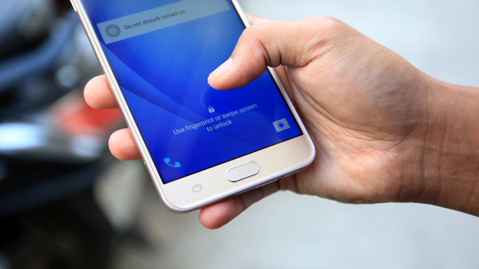
The be-all-and-end-all of user interactions, way back in the day, were hover states. Position your cursor over an element and it’ll change in someway to indicate that it does something.
Un-styled links in all browsers still have the same four states:
- normal (blue)
- hovered (cursor becomes a little hand)
- active (red)
- visited (purple)
These states exist to give the user a visual indication that their actions are having an effect. Through CSS and JavaScript, we can manipulate these styles and make a variety of fancy interactions; from different colours to animations.
From these humble beginnings, interactions grew into the all-singing/all-dancing world of the modern user interface. Micro-interactions followed on from this – those unobtrusive little helpers dotted around applications that make life easier and make using an interface intuitive and seamless.
For example, Gmail gives you a warning if you say attached in an email but don’t actually attach something, spell-checkers underline misspelled words for you, images on websites zoom/change colour/blur/rotate/turn into videos on hover to indicate that they do something, the Slack app only sends push notifications when the desktop app is closed or you’re idle, the list goes on…
The Good Side
Obviously, there are micro-interactions that are helpful: Instant form-field validation – reminding you that email addresses have an @ in them when you move out of the email field, for example. WordPress has recently introduced saving a post when pressing CTRL-S (CMD-S on a Mac). These, largely unobtrusive, micro-interactions make for a nicer, more fluid, experience.
Helpers and Delighters
Interactions can be broken down into two broad groups: Helpers and Delighters. Helpers anticipate user behaviour and make suggestions. We mostly don’t even notice them (except when they go wrong!). These would include:
- Suggested search terms
- automatic form completion
- swipe to dismiss/archive/delete
- converting emoticons into emojis (and yes, they’re different!)
- “user_name is typing” in instant messaging clients
Delighters are distinctly non-functional micro-interactions that make the user experience nicer. Usually taking the form of animations, in-jokes, or little humanising touches. Some examples are:
- un-read notifications indicator on the icon (similarly number of items in a checkout basket)
- BBC iPlayer’s volume goes up to 11
- Outlook’s “You’ve reached Inbox Zero!” message on emptying your inbox
- Videostream’s friendly, nerdy, and amusing loading messages
Some have become so prevalent that I now notice when they’re not included – like pull-to-refresh in a lot of mobile apps.
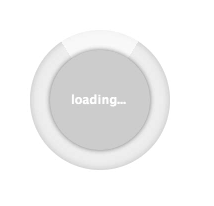
The lie that is loading indicators
Whether it’s spinning wheels, morphing blobs, or the more traditional horizontal bar filling up, we’ve all seen loading indicators but how many of us are aware that they’re a huge lie?
An extension of the Gannt chart, they were adopted by the digital world following a paper published by Brad Myers in the mid-eighties that concluded users felt decreased anxiety given an indication that something was happening in the background. File transfer rates over a network (especially the internet or wi-fi) are too unreliable to accurately calculate remaining time so, rather than bother, most contemporary progress bars or loading indicators are simply an arbitrary indicator that the software hasn’t frozen rather than an indication of actual activity – called ‘throbbers’ in the industry.
It’s a lie but, given it reduces user disengagement, I think it’s a good lie.
Chris Coyier
The Dark Side
What is the dark-side of micro-interaction? Ranging from the irritating to the detrimental, there are occasions where this nanny-state of development isn’t necessarily the best thing for users. With the prevalence of netspeak/textspeak (OMG, WTF, non moar bad spel than this!), spell-checkers start to highlight everything! Admittedly, this is being negated by applications adding frequently used phrases to custom dictionaries, but it can be irritating when an app tells me that I’ve spelled my girlfriend’s name wrong!
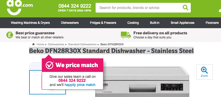
Highlighting a product name on ao.com presents a pop-up advertising their Price-Match scheme. I imagine there are some people that would be impressed or helped by this but it bugs me!
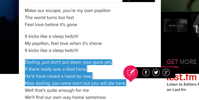
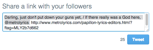
Highlighting text on Metro Lyrics brings up the option to post on Facebook, Twitter, or Google+. However, they’ve chopped off half the quote and replaced it with a link to their own site. This isn’t helpful to me at all!
Helpful IOS
The IOS mail client automatically turns dates, any number, and addresses into links that hook into the calendar, dialler, and maps applications respectively. This is all well and good but can be annoying when copyright dates and company HQ addresses in promotional emails are turned into links making them more prominent than they should be or when the blue font is rendered unreadable against the background colour. More annoyingly, when an account number is turned into a click-to-call phone number to nowhere! This is such an issue that <meta content="telephone=no" name="format-detection"> exists to counter it.
Hijacking UI
Hijacking well-established actions in a user interface is another way to annoy people! Changing the scroll direction, or redirecting the ‘Back’ button to an advert, and displaying a “Sign up to our newsletter” pop-up half-way through an article (or when your cursor heads towards the address bar/back button) are all ways to get people’s backs up.
The Future
So, how do I see the future of micro-interaction? Despite the flaws, some of which I’ve pointed out here, they are definitely here to stay. But how can they develop? I see a lot of effort going in to make them more accurate. Google is already ahead of the curve on this one – the bordering-on-the-creepy-ness of Google Now is a good example: scanning emails and calendars, offering travel tips based on your commute to work and the time of day, and generally automatically organising your life so you don’t have to bother.
Factoring in wearable tech and the Internet of Things, I envisage watches telling you to go to the door just as the postman arrives, automated replies to invitations when you’re double-booked, cars that drive you home from work without prompting, houses that automate lights/heating/music/run a bath based on who has just walked in, where they’ve come from and what they’re most likely to want.
Tech knows you’ve just got home from work, your calendar has been back-to-back meetings all day, it’s raining outside, and your train was half-an-hour late! So, when you walk through your front door, the heating is on, a bath is run, soothing music is playing, and the kettle’s just boiled.
We’re becoming steadily more connected with technology, technology is learning more and more about us and our habits and routines, and this will inevitably lead to helpful interactions getting better at judging what we’re most likely to do in a given situation. And, along side that, those tiny little personal touches will continue to delight us.
Conclusion
The purpose of a micro-interaction is to humanise the interface, provide instant feedback, to keep the user ‘in the loop’ so they feel engaged. There are occasions where applications can be too “helpful”. For every user that is helped, there will be someone annoyed by the exact same thing. I know what I’m doing, I don’t need a nanny-state suggesting I’m doing things incorrectly all teh timez.
This post was originally posted on shoot-the-moon.co.uk