
Why is a soap bubble round? Or: When and where to use square bubbles
The laws of physics, those undeniable laws of the universe that we can’t help but abide by, make round soap bubbles. They make green grass and wet water and rainbows that can only be seen between 40 and 42 degrees. These are templates crafted over millennia that just simply work.
Flippantly, websites are the same. Logos in the top left, horizontal navigation just under the logo, copyright information right at the bottom of the page, buttons that look like buttons, search bars with a magnifying glass, etc. These are all things designers, UX specialists and developers have crafted, broken, modified and, importantly, taught users to use since the dawn of the web. They are tried-and-tested best practices that we’ve all learned to deal with. So, you’ve got a new website to build – do you copy/paste the last site you built, change the colours and deploy it or open up a blank Photoshop (other graphic design software is available) document and delve deep into your creative conscious for something truly mind-blowing? When should you use a square bubble?
The awards for design, creativity and innovation on the Internet
Awwwards.com‘s mission is “to discover, recognize, and promote the talent and effort of web designers, developers, and agencies who create unique digital experiences that are useful, innovative, intuitive, and beautiful.” and their site is full of examples of truly stunning works of art. A quick flick through the winners page shows a range of eye-catching techniques in use such as full-screen video, lush parallax and animation, immersive interaction, and a fair few lovely examples of messing around with typography. One thing they all seem to have in common, however, is that they’re predominantly portfolio or brochure sites – nice marketing tools, occasionally existing only for the duration of a campaign before rotting away on a server behind long-forgotten login details.
By contrast, the world’s top ranking e-commerce sites all look a bit naff in comparison. But – and it’s a big but (no sniggering!) – they work. I’ll stick with Amazon here, partly because they’re number one on the list and partly because I use Amazon all the time so I feel more confident in dissecting their site. I don’t think there’ll be much disagreement when I suggest that don’t imagine amazon.co.uk winning any awards for their “useful, innovative, intuitive, and beautiful” website.
Amazon vs Publicis90: The Great Homepage War 2016™
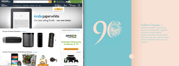
Amazon takes the traditional approach – logo top left, search bar, hero carousel. This is a layout you’ll find floating around the internet like so many round bubbles.
In contrast Publicis90 have filled half of their screen real-estate with their logo and hidden the navigation almost completely until you click the little down arrow at the bottom. Incidentally, they draw your attention to this subtle button with a slick loading animation that builds the button as the content is served in the background. Irritatingly, the page doesn’t appear to scroll down when you click the down button but new elements animate into the screen.
While I’ve been writing this article, I’ve been back to the Publicis90 website a few times and, by now, it’s starting to annoy me – it seems to have been designed for very infrequent use. It does look beautiful, the animation is smooth and fluid and, for all my complaining about the hidden navigation, it doesn’t take more than a second two figure out what you’re doing. It’s been well put together – I don’t want this to be seen as any sort of negative critique of this particular site!
Amazon has invested heavily in its one solitary goal – selling things. Craig Smith over at Expanded Ramblings suggests that 44% of online shoppers go directly to Amazon to make a purchase which may well account for their 2.7 million average daily hit rate. Amazon has employed a wealth of tricks and clever thinking into making it appear that their site loads super-fast – no soothing animations or loading bars here because jazzy animation here is a barrier to sales.
For Publicis90 on the other hand, the demographic they’re aiming for (digital creatives looking for funding) are more likely to follow the site through to its conclusion than be put-off by the measured pace of page loads.
The most interesting thing to note is that Amazon actually loads slower. There was a factoid floating around the internet a while ago that Amazon loses $1.6 billion dollars a year for every second their page load slows down. Again, a lot of effort has gone in to deferring loading of elements to fool the user into thinking it’s loaded quickly enough to save them $1.6 billion.

Amazon takes around 40 seconds to load – though you wouldn’t know it!
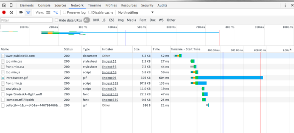
Pulicis90 comes in at around a second.
Design is beautiful, design is practical.
This is not too say that ecommerce sites can’t be beautiful. There are some lovely lush examples around but beauty and practicality aren’t mutually exclusive. Publicis90’s site certainly has practical elements: it renders well on mobile devices with large thumbable links and a slick, smooth, although pared-down animation on navigating around.
One site that strikes a nice balance is Netflix. The video-on-demand giant’s website combines traditional – logo in the top left, account and search in the top right, copyright at the bottom – with a quirky sideways-scrolling ‘bookshelf’ navigation that has reeled in 75 million users in almost every country on earth.
The right tool for the right job
When it comes to the internet, there’s no such thing as a one-size-fits-all approach.
The best way to decide whether you want to go for something ground-breaking or more traditional is to apply the old adage the right tool for the right job. When it comes to the internet, there’s no such thing as a one-size-fits-all approach. Consider your user, consider your goals, and create the right solution to solve the problem.

Few things will drive users away from your site (and to one of your competitors) than using the inappropriate solution. However pretty your e-commerce site is, speed and durability come first. Likewise, few will be impressed by your creative portfolio if it looks like a discount supermarket.