
McDonald’s Sauce Dispenser is the greatest product ever
OK, that’s a bold statement! I guess I should elaborate. Like a lot of teenagers, I worked in a Maccies one summer and I was struck by how awesome the sauce dispenser was.
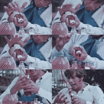
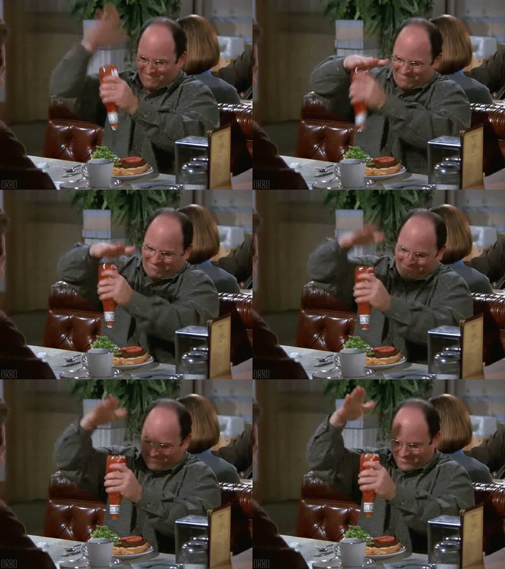
Basically, it’s a funnel attached to a handle with a trigger. Pulling the trigger releases 5 dots of ketchup in a quincunx onto the bun. I used this device almost every day and, now that I work in software development, I have decided it’s the greatest product ever.

The greatest product ever!
The amount of effort and money that has gone into developing this device is surely astounding. McDonald’s are a decidedly profit-driven enterprise. The sauce gun dispenses exactly the right amount of condiment – enough to finely coat the meat when the bread is put on top but not cost the company unnecessary overheads.
What makes this relevant to software development is that the sauce dispenser does what every good product should do – one thing…and one thing really well.
Everything to everyone
The best products don’t try to be everything to everyone – the ones that do always seem to come across as novelty items. To use an example from the real world, I’m not convinced that a coffee maker and toaster in one would make coffee and toast better that a coffee-machine and a toaster as separate appliances.

Yes, that’s a knispork!
Similarly, the best apps only do one thing and they do it really well. 500px for photo sharing, DropBox for storing files in the cloud, Google Keep for taking notes. I love Keep. Sure there’s Evernote and Quip and [insert any other “note-taking” app here], but Keep is so ridiculously simple it’s a dream to use.
Too many products suffer from “feature bloat” where stakeholders keep adding new shiny features into a product. Of course, additional functionality isn’t necessarily a bad thing but these things usually come at a cost. How many times have you had to sideline tech debt to implement a new feature? How often do you see “delighters” put into an app instead of fixing a glaring bug?
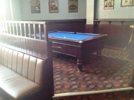
It is the equivalent of the pub that puts a pool table in but never cleans the floor – and we’ve all been there!

Alienating your core audience
One reason additional features can be the worst thing for your product is alienating your core audience.
Earlier this year, Atlassian bought Trello, reportedly to serve a chunk of their core demographic that was turning away from Jira.
Jira started life as a bug-tracker. A simple piece of software for tracking tickets, now it’s one of the most popular project management tools in the world used by big names such as Twitter, Skype, and NASA as well as over 50,000 more.
In The Innovator’s Dilemma, Clayton Christensen explains that companies are in danger of racing ahead for greater, more lucrative markets, and leave a void behind them to be exploited. This is what happened to Jira; a plucky young upstart rode their coat-tails picking up disgruntled users like gulls following a fishing trawler.
[Trello offers] a fun new way for teams to organize the often messy range of information that feeds into great teamwork
Mike Cannon-Brookes, Atlassian CEO
Basically, as Atlassian’s flagship product got more complex, those users who initially started using it for its simplicity began to jump ship.
This time next year, Rodney…
Of course, not all products that succeed remain doing their initial function. Amazon began life just selling textbooks to students, Google was only a search engine before they moved into conquering every facet of the internet.
But imagine the chaos of Jeff Bezos’ garage if Amazon had started by selling the range of products they do today.
Where Amazon succeeded here was with their mission statement:
Our vision is to be earth’s most customer-centric company; to build a place where people can come to find and discover anything they might want to buy online.
Amazon’s Mission Statement
The promise to do one thing perfectly and not alienate users is right there in the statement.
By ensuring that every potential feature must align with the mission statement, we are in a stronger position to push back on every single feature under consideration.
By justifying features, we can make sure they are added for the right reasons and we can reduce feature bloat in our products.
When David Hasselhoff’s Michael Knight first sees KITT’s dashboard in Knight Rider he remarks that it reminds him of Darth Vader’s bathroom. Faced with so many buttons and levers and switches, it becomes difficult to drive a car – the fundamental use-case. Admittedly, KITT was self-driving but, I promise, my point still stands!
And so, we’re back to sauce dispensers.
If the ketchup dispenser also deposited pickles and mustard, we’d have a burger quicker but that many moving parts would render it a nightmare to maintain. You wouldn’t be able to put pickles on anything if the ketchup ran out. Cleaning it every night would be horrendous!
So the humble sauce dispenser dispenses sauce. Perfectly.
McDonald’s brand mission is to be our customers’ favorite place and way to eat and drink… We are committed to continuously improving our operations and enhancing our customers’ experience.
McDonald’s Mission Statement
Again, the promise to do one thing perfectly while not alienating users is right there in the statement.
- Do one thing perfectly
- Don’t alienate users
- Repeat ad infinitum
Does a special device that provides a regimented amount of ketchup align with the corporate mission statement? Of sauce it does!


